WORK / STUBY
STUBY
Your Study Buddy
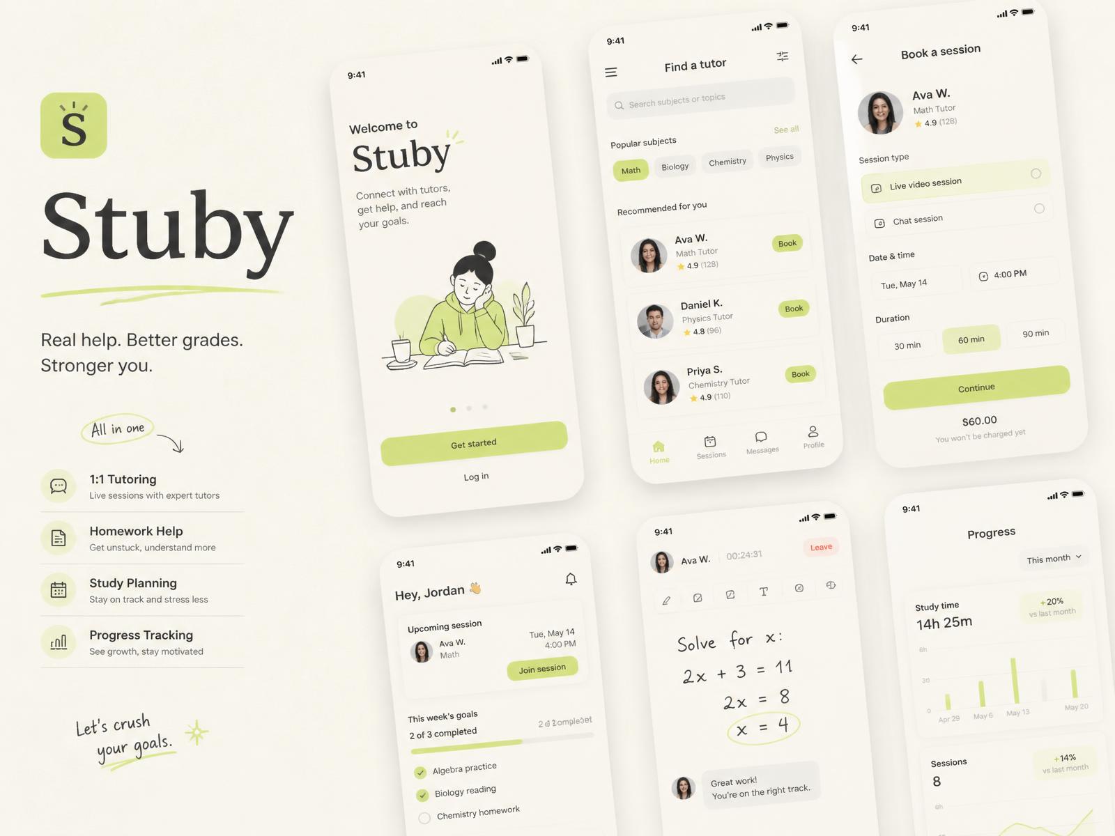
Finding a tutor isn't difficult. Finding the right tutor is.
- ROLE
- UI/UX Designer
- SCOPE
- Research, UX Strategy, UI, Prototype, Testing
- TOOLS
- Figma, Adobe
- YEAR
- Product Design / UI UX — 2024
Context
Indonesian students have no shortage of tutoring options — marketplaces, community groups, school noticeboards. The hard part is judging fit before you have paid for a session. Stuby started as a question: what if matching came first and browsing came second?
Research
Interviews with students and parents, plus a walkthrough of five existing platforms. Recurring theme: profiles read like résumés, not like people you would learn from.
- 8 student interviews (SMA & first-year university)
- 5 competitor teardowns
- Diary study on how sessions actually get booked
- Survey on what makes a tutor 'click'
Problem
Students judge tutors on credentials they can't verify, and give up before the first lesson.
Design Process
Site Map
User Flow
Brand System
A soft, studious palette with a single green accent, rounded type and illustration that keeps the tone encouraging rather than academic.
Onboarding Questionnaire
Six short questions — subject, goal, pace, learning style, budget, schedule — framed as a conversation instead of a form. Each answer weights the match score.
Tutor Discovery
Cards lead with teaching style and a short intro clip; credentials sit underneath, where they belong.
Micro Teaching Video
A 45-second sample lesson on every profile. In testing this was the single strongest signal students used to shortlist.
Matching / Search
Match score is explained in plain language — students can see which of their answers drove a recommendation and adjust them inline.
Messaging
Templated openers remove the awkward first message and speed up first replies.
Scheduling
Availability is shown as overlapping windows between student and tutor, so booking is a single confirmation rather than a negotiation.
Testing
Moderated usability testing with six students on a clickable prototype. The questionnaire length and the match-score explanation were both revised afterwards.
- Cut onboarding from 11 to 6 questions
- Moved micro-video above the fold on profiles
- Rewrote match reasons in plain language
- Added a 'not a fit' action to refine results
Reflection
Stuby taught me that a matching product is mostly an editorial problem: deciding what to show first is the design. If I picked it back up, I would test trust signals for parents, who quietly hold the budget.