WORK / MCDELIVERY
McDELIVERY
UX Redesign
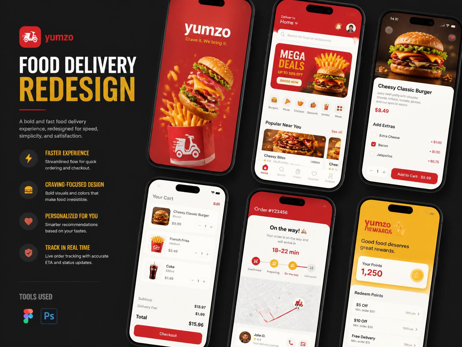
Reimagining a familiar delivery experience — fewer taps between craving and checkout.
- ROLE
- UX / UI Designer
- SCOPE
- UX Audit, Personas, Flows, UI Redesign
- TOOLS
- Figma, Photoshop
- YEAR
- Self-initiated — 2024
Overview
A self-initiated redesign of a mainstream fast-food delivery app. The goal was not a restyle: it was to shorten the distance between opening the app and confirming an order, without losing the promotional density the business depends on.
Pain Points
- Promo banners compete with the primary order action
- Menu categories buried under carousels
- Cart edits require leaving the checkout flow
- Order tracking gives status, not expectation
- Repeat orders take as many taps as new ones
User Personas
Three archetypes shaped the work: the late-night repeat orderer, the family bulk orderer, and the deal hunter who opens the app only when there is a promotion.
Target User
Priority was given to the repeat orderer — highest frequency, lowest tolerance for friction, and the group whose behaviour is easiest to design a shortcut for.
UX Problems
The app is optimised for browsing offers, while most people arrive already knowing what they want.
Proposed Solutions
- 'Order again' as the first home module
- Persistent, editable cart drawer
- Category rail pinned above promotions
- Tracking with a time expectation, not just a status
- Deal hunters get one consolidated offers tab
Feature Improvements
Item customisation moved inline, so extras are chosen without opening a new screen, and the checkout summary stays visible while editing.
Interface Redesign
Stronger type hierarchy, larger food imagery, and a single accent for actions so the promotional colour no longer competes with the buttons.
Final Screens
Reflection
Redesigning a household product is a lesson in restraint: every element is there because some business need put it there. The interesting work was sequencing, not deletion.